
An issue of the Society’s newsletter, transcribed from the original.
(8 pages, 1.8 MB)
the full-resolution scan, 26 MB, for close research
Page 1 — DESIGN IN EVERYTHING
Canadian Leathercraft
Volume XVI No 2 Spring, 1967
DESIGN IN EVERYTHING by Mrs. Hilda Darbyshire
Perhaps the best designer we have encountered is Nature herself, and many of the designs found in Nature can be used by the Leathercrafter. Some of our members hesitate to work on designs of their own, excusing themselves by saying they "just don't have the time to spare." This could be quite true of course, or it could be rationalizing. Actually, we are all designers with variations in abilities. The lady of the house who moves her furniture around to create a more functional and pleasing arrangement is designing just as surely as the landscape gardener. Basic to good design is PLANNING and EXECUTION and once we know what is involved in these two facets, we are well on the way to new horizons. Let us first turn our attention to PLANNING.
Just as the architect uses a plan for his buildings, so must we plan our work in such a way that it meets certain standards of CREATIVITY, IMAGINATION and SELF-EXPRESSION, and at the same time employing what have become standards of COMPOSITION. Planning must also imply function and simplicity of construction, and we all know how functional are our purses, wallets, bags, and so on. In planning our work then, we must consider each of these aspects and arrive at a balance where each of them assists the other - a wedding of the whole. This does not mean that the design may have no dominant features, there should be strong points, but these should be properly located, and masterfully executed. And this brings us to perhaps the most important part of our plan - composition.
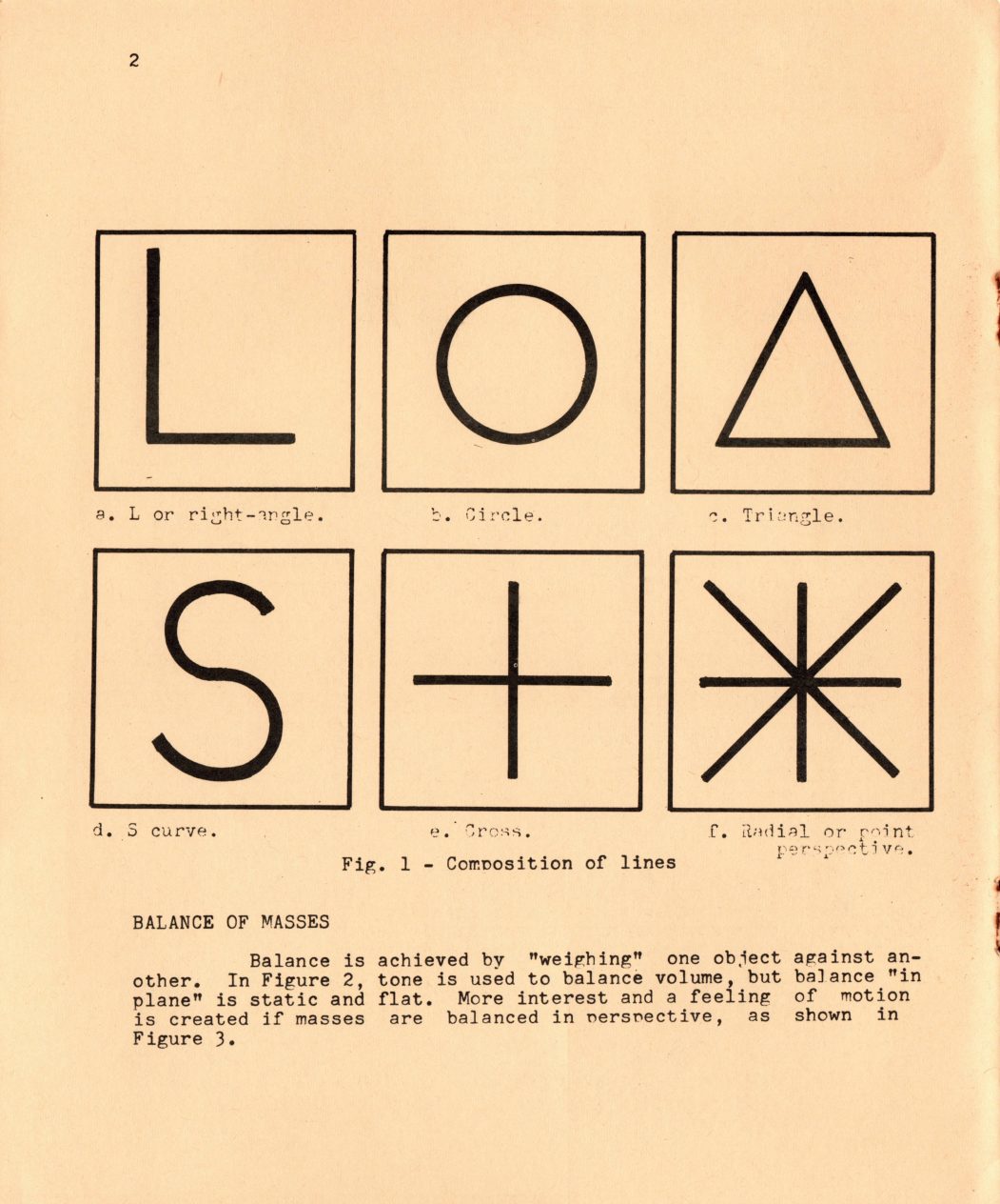
Composition simply is the balance of masses, and once we know how they should be balanced, a major problem will be overcome. Fortunately, certain ground rules have already been established, and although we might term them "traditional approaches" they embody what most of us have found to be most pleasing. The basic forms of composition are illustrated in Fig. la, b, c, d, e and f and it is on the basis of this form of composition that we take the next step - the balance of masses.
Page 2
a. L or right-angle. b. Circle. c. Triangle.
d. S curve. e. Cross. f. Radial or point perspective.
Fig. 1 - Composition of lines
[Fig. 1 is a diagram of six boxes, each containing a line shape, labelled a to f as above.]
BALANCE OF MASSES
Balance is achieved by "weighing" one object against another. In Figure 2, tone is used to balance volume, but balance "in plane" is static and flat. More interest and a feeling of motion is created if masses are balanced in perspective, as shown in Figure 3.
Page 3
Analysis. Analysis.
Fig. 2 Fig. 3
Now that we have established two basic starting points, the Composition of Lines and the Balance of Masses, we now turn to consideration of the remaining space that is available. Most authorities agree that composition includes the following:
(1) APPEARANCE - what the eye sees physically.
(2) WHAT THE EYE IMAGINES - The reality made up of appearance and a knowledge of the subject (see Fig. 4). (3) DEEPER EMOTIONAL IMAGE - the conditioning of an artist by his sensitivity to the subject.
Page 4
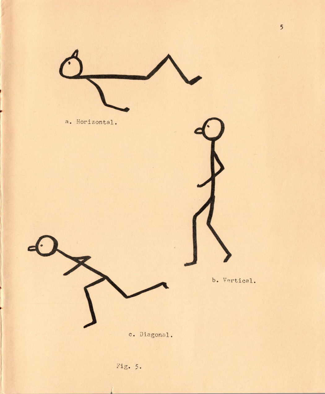
a It is worth noting at this point, that lines can create an emotional effect at the same time that the eye is led to the centre of interest. Horizontal lines tend to suggest tranquility, a sense of calmness and peace. We could make use of these in scenes depicting lakes at rest or the "lowing herd winding o'er the lea". Vertical lines give height to a work, for example, columns. They suggest dignity, strength and solemnity. While vertical lines will tend to provide stability, diagonal lines give a feeling of movement and speed. The more slanting the line, the greater the action implied. Indeed, the line can be slanted to such an extent that it is unbalanced. Figure 5 illustrates these situations with a stick-figure. Fig. 5a shows a figure "at rest". The walking figure, shown in Fig. 5b, is representative of the verticle line, while in Fig. 5c, the running figure is leaning to such an extent that he is liable to fall over,
Curved lines suggest femininity, restlessness, and to some extent, weakness. The graceful sweep of the willow, and the dancing clouds are examples where use would be made of the curved line - apart from the female form.
BALANCE IN DESIGN
We have already mentioned the Balancing of Masses, and the importance that can be attached to this aspect of design. Recognising then that the designer has arranged a suitable balance, he must next place his design on his leather. It is advisable, except in rare cases, to avoid centering the principle point of interest. A simple way to establish the location of the point of interest - and usually, there should be only ONE point of interest, is to sketch
[A stray underscore is not part of the printed text: "to a_ work," is set out here as "to a work,".]
Page 5
[This page is a plate of three stick-figure sketches under Fig. 5, illustrating line direction, captioned below.]
a. Horizontal.
b. Vertical.
c. Diagonal.
Fig. 5.
Page 6
an outline of the object (physically or mentally) and divide the space both horizontally and vertically into thirds. <Any of the four circled places are suitable for the centre of interest. These points are usually referred to as the "strong points of composition", and are illustrated in Fig. 6.
CIN CIN
Fig. 6 Strong points of composition
A design may of course, be balanced in weight of line or texture, and it is in this area that the "sky is the limit" for the leather-craftsman. Although limited to some degree in the use of color he can, by the skill of his tools, show light and shadow as did the wood-cut artists of old, and modern-day photographers.
If you have an attractive motif that looks "lost"" in the leather, interest can be created by a suitable frame. This is not a new technique, but one that is not too frequently used by leather- == crafters. Place the motif within a frame - a tree, or an archway, or an open window - and purposely subjugate the foreground to emphasize the object within. This does not mean that we should lose the quality of our medium - leather - within a mass of carved or tooled shapes. Remember, the very essence of good design is simplicity. So, if a frame is to be used, Keep it simple and functional. This idea is illustrated in Fig. 7. Fig 7 Keep it simple
Page 7
We have made mention of a most important word SIMPLICITY. Actually, in speaking of good design, we could go further' than speak in terms of simplicity - we could say "LEAVE OUT". Too often, the life of a beautiful piece of leather is slashed to pieces under the restless knife of the leather-crafter bent upon carving a masterpiece. Perhaps this point can be better explained this way.
Suppose you are out in the car one day, and see a scene that has particular appeal for you. You photograph it, and have the film processed. Eventually, you have an enlargement made of the picture, say 8" x 10", Using a mapping pen and waterproof India Ink outline right on the picutre, the most important parts, or the parts that you yourself feel would made a good composition. While waiting for the ink to dry, prepare a bleach bath consisting of Potassium Ferricyanide and Hyposulphate. Pour this into a dish large enough to take the 8" x 10" picture. You can actually purchase this bleach from a photography store - just ask for Farmers Reducer. Immerse the picture in the dish, picture side up, and you will see the original picture gradually disappear.
What is left is. basically an etching provided by Nature, and it was presented to you free, and for the taking.
This opportunity is all before you all that is needed are the eyes to see it. Of course the picture may NOT be exactly the way you would like it, and here is where you have a free hand to make any changes in accordance with GOOD DESIGN. For example look at the scene shown in c WP Z, a Fig. 8. This is an everyday ee scene, but missing in one important detail - it has no depth. Shade in the dotted area, the tree in the right foreground, and notice how this gives depth to the scene, and makes for a more acceptable picture.
Page 8 — CRAFTY BITS
In summing uv what has been said then we emerge with these points: Design requires planning and execution. The ability to perform the work is taken for granted - we are leathercraftsmen. Planning involves creativity, imagination and self-expression.
Additionally, we must make use of the rules of composition. These require a basic knowledge of the composition of lines and the balancing of masses. The lines that we use may be straight or curved depending upon the situation we are trying to create. Texture is a plus as far as the leather-crafter is concerned, and careful selection of materials will further enhance the work provided that it is permitted to do so. Make use of the simple devices that focus attention upon the work - frames, trees, archways, and so on. And finally, when deciding upon a design, ask yourself before you make that first cut, does every line mean something, or can some be j left out.
The golden rule is simplicity: leave out what is extraneous.
CRAFTY BITS
Three of our C.S.C.L. members had the honor of having an article chosen by the Canadian Handicrafts Guild (Ontario) to be placed at the very exclusive exhibition at Dartmouth College, Hanover, N.H. They were Mrs. Clara Cavanagh, Barrie - Tote Bag; Daphne Lingwood, Caledon East - leather necklace and Olivia Smith, Toronto - belt with stirling buckle. Congratulations!
Mrs. Lillian Beech, Burlington was honored at Hamilton's 10th Anniversary banquet in November 1966 for her perfect attendance record for the first 10 years of the Hamilton Branch of C.S.C.L.
A presentation of a leather pen stand was made to Lillian for her faithful services. Lillian became an Associate member in 1966 and was the convener of the 10th Anniversary party and now is the new 1967 chairman of Hamilton Branch. Can you beat this?
The editor regrets that the following names were omitted from the last bulletin: Gladys Riddell on the C.S.C.L. executive council and on the I.A.L.C. executive - Mrs. May Corbett as program { convener and Sherle Bottrill as social convener. Sorry girls!
[A stray mark that had stood between "be" and "placed" in the Crafty Bits item was not part of the print; removed.]